You probably own a graphing calculator that does calculations
and draws mathematical graphs. It is easy to carry around
and use, but you cannot copy the results onto paper. The graph
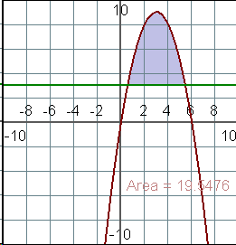
at the right was drawn with a computer program, so the picture could
easily be copied into this page. It shows that the area between
the curve  and the line
  is approximately 19.5 . (http://www.graphcalc.com)
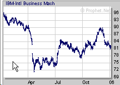
Graphs and diagrams let us easily see relationships between data. This is much easier than looking at a bunch of numbers. This chart shows stock prices for IBM during last year. It is easy to see that the price dropped suddenly in April, but has generally increased since then, but dropped again last month. This is all much easier to see in a graph than in a long list of numbers. (http://www.prophet.net/ )
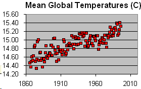
It is similarly difficult to see that average world-wide temperature has increased over the past 150 years by looking at numbers. This chart makes it easy to see the trend of increasing temperatures. (warming.xls)
When a rock falls, it will fall 5 meters in the first second, then 15 m in the next second, then 25 m in the third second, then 35 m, etc. We can write down numbers and add them up to figure out when the rock will hit the ground 1000 m below, but it is easier to understand what is happening when we look at a graph. Judging from the graph, it looks like the rock will hit the ground after about 14 seconds. (www.graphmatica.com)
Height in meters
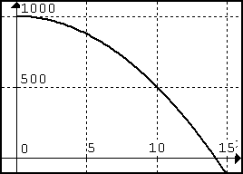
Time
in Seconds
 (you need to type 6x - x^2). Measure the
area under the curve,
(you need to type 6x - x^2). Measure the
area under the curve,  on the same graph. Then shade the area between the two
graphs.
on the same graph. Then shade the area between the two
graphs.